
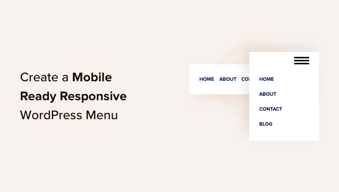
How to Create a Mobile-Ready Responsive WordPress Menu
Introduction: The Importance of a Responsive WordPress Menu
In today’s mobile-first world, ensuring your website provides a seamless experience across all devices is paramount. A crucial aspect of this is having a responsive menu that adapts gracefully to different screen sizes. A poorly designed mobile menu can frustrate users, leading to higher bounce rates and a negative impact on your website’s overall performance. This article will guide you through various methods for creating a mobile-ready responsive WordPress menu, catering to different skill levels and preferences.
Understanding Responsive Design Principles
Before diving into the technical aspects, it’s essential to grasp the core principles of responsive design. Responsiveness is all about flexibility and adaptability. Key concepts include:
- Fluid Grids: Using relative units like percentages instead of fixed pixels allows elements to resize proportionally to the screen size.
- Flexible Images: Ensuring images scale appropriately without overflowing their containers or becoming pixelated.
- Media Queries: CSS rules that apply different styles based on the device’s characteristics, such as screen width, height, and orientation.
These principles form the foundation for building a responsive menu that looks and functions flawlessly on desktops, tablets, and smartphones.
Method 1: Utilizing WordPress’s Built-in Menu Features
WordPress offers basic menu functionality that can be enhanced for responsiveness without requiring extensive coding. This approach is ideal for beginners and those seeking a simple solution.
- Create a Navigation Menu: Navigate to Appearance > Menus in your WordPress dashboard. Create a new menu and add the desired pages, posts, or custom links.
- Assign the Menu Location: Assign the menu to a designated location in your theme (e.g., “Primary Menu,” “Top Menu”). This location will vary depending on your theme.
- Enable Mobile View (Theme Dependent): Many modern WordPress themes include built-in responsive features. Check your theme’s documentation to see if it automatically converts the menu into a mobile-friendly format (often a “hamburger” icon).
While this method is straightforward, it might not offer the level of customization you desire. The mobile menu’s appearance and functionality will be largely determined by your chosen theme.
Method 2: Implementing a CSS-Based Responsive Menu
For greater control over the menu’s appearance and behavior, you can create a responsive menu using CSS. This method requires a basic understanding of HTML and CSS.
HTML Structure:
The basic HTML structure of a navigation menu typically involves an unordered list (<ul>) containing list items (<li>), each with an anchor link (<a>).
<nav>
  <ul class="menu">
    <li><a href="#">Home</a></li>
    <li><a href="#">About</a></li>
    <li><a href="#">Services</a></li>
    <li><a href="#">Contact</a></li>
  </ul>
</nav>
CSS Styling:
The CSS is where the magic happens. You’ll need to style the menu for both desktop and mobile views using media queries.
Desktop Styles:
.menu {
  list-style: none;
  margin: 0;
  padding: 0;
  display: flex; /* Arrange items horizontally */
  justify-content: space-around;
  background-color: #333;
}

.menu li a {
  display: block;
  color: white;
  text-decoration: none;
  padding: 15px;
}

.menu li a:hover {
  background-color: #555;
}
Mobile Styles (using a Media Query):
@media (max-width: 768px) {
  .menu {
    flex-direction: column; /* Stack items vertically */
    display: none; /* Initially hide the menu */
  }

  .menu li a {
    text-align: center;
    padding: 10px;
  }

  /* Style for the "hamburger" button (example) */
  .menu-toggle {
    display: block; /* Show the button on small screens */
    background-color: #333;
    color: white;
    padding: 10px;
    text-align: center;
    cursor: pointer;
  }

  /* JavaScript (or CSS) to toggle the menu's visibility */
}
JavaScript Toggle (Optional):
To make the mobile menu appear and disappear when the “hamburger” button is clicked, you’ll need a bit of JavaScript.
<script>
  const menuToggle = document.querySelector('.menu-toggle');
  const menu = document.querySelector('.menu');

  menuToggle.addEventListener('click', () => {
    menu.style.display = menu.style.display === 'none' ? 'flex' : 'none';
  });
</script>
Remember to place this JavaScript code within the <body> tag of your WordPress theme, preferably just before the closing </body> tag.
Method 3: Utilizing a WordPress Menu Plugin
Several WordPress plugins simplify the process of creating responsive menus. These plugins often provide a user-friendly interface and a wide range of customization options.
Popular responsive menu plugins include:
- Responsive Menu: A lightweight and highly customizable plugin.
- Max Mega Menu: A powerful plugin for creating complex and visually appealing menus.
- WP Mobile Menu: Specifically designed for creating mobile-friendly menus.
To use a plugin:
- Install and Activate the Plugin: From your WordPress dashboard, navigate to Plugins > Add New. Search for your chosen plugin, install it, and activate it.
- Configure the Plugin: Access the plugin’s settings page (usually found under Appearance or in its own dedicated menu item).
- Customize the Menu: Follow the plugin’s instructions to create and customize your responsive menu. This typically involves selecting the menu to use, choosing a mobile menu style, and adjusting settings like colors, fonts, and animations.
Plugins offer a convenient way to create responsive menus without requiring extensive coding knowledge. However, be mindful of plugin bloat – choosing a well-coded and lightweight plugin is crucial for maintaining your website’s performance.
Method 4: Using a Theme with Built-in Responsive Menu Support
The simplest solution is to select a WordPress theme that natively supports responsive menus. Many premium and even some free themes come equipped with this feature. Before choosing a theme, carefully review its features and ensure it offers a responsive menu that meets your needs.
Things to consider when choosing a theme for responsive menus:
- Mobile Friendliness: Test the theme’s demo on various devices to ensure the menu displays correctly and is easy to navigate.
- Customization Options: Check if the theme allows you to customize the menu’s appearance (colors, fonts, icons) to match your brand.
- Performance: Opt for a theme that is optimized for speed and performance. A poorly coded theme can negatively impact your website’s loading time.
Using a theme with built-in responsive menu support minimizes the need for additional plugins or custom coding, streamlining your website development process.
Testing and Optimization
Once you’ve implemented a responsive menu, it’s crucial to test it thoroughly on different devices and browsers. Use browser developer tools to simulate various screen sizes and orientations. Pay attention to:
- Layout: Ensure the menu elements are correctly positioned and don’t overlap or break.
- Usability: Make sure the menu items are easy to click or tap on mobile devices.
- Performance: Check that the menu loads quickly and doesn’t cause any performance issues.
Continuously monitor your website’s performance using tools like Google PageSpeed Insights and make adjustments as needed to optimize the menu for the best possible user experience.
Conclusion
Creating a mobile-ready responsive WordPress menu is essential for providing a positive user experience on all devices. Whether you choose to leverage WordPress’s built-in features, implement a CSS-based solution, utilize a plugin, or opt for a theme with built-in support, the key is to prioritize responsiveness, usability, and performance. By carefully considering your needs and following the guidelines outlined in this article, you can create a menu that enhances your website’s navigation and improves its overall user experience.
- How to Add Nofollow Links in WordPress Navigation Menus
- Internal Linking for SEO: The Ultimate Guide of Best Practices
- How to Add an HTML Sitemap Page in WordPress (2 Ways)
- How to Create an Online Restaurant Menu in WordPress (Step by Step)
- How to Easily Create Responsive WordPress Image Galleries with Envira
- How to Add a Slide Panel Menu in WordPress Themes
- How to Add Custom Navigation Menus in WordPress Themes