
How to Add a Slide Panel Menu in WordPress Themes
Introduction to Slide Panel Menus
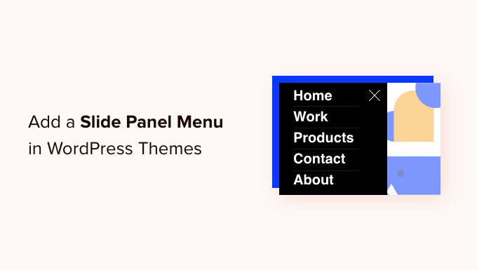
Slide panel menus, also known as off-canvas menus or hidden navigation, have become increasingly popular in modern web design, especially for WordPress themes. They offer a clean and space-saving solution for displaying navigation options, particularly on smaller screens like smartphones and tablets. Instead of the traditional horizontal navigation bar, a slide panel menu remains hidden off-screen until triggered, usually by a hamburger icon or similar button. When activated, the menu slides into view, revealing navigation links, search forms, social media icons, and other content. This approach improves the user experience by decluttering the interface and providing a more focused browsing experience.
Benefits of Using a Slide Panel Menu
Using a slide panel menu offers several advantages:
- Improved User Experience: Slide panel menus declutter the website’s header, especially on mobile devices, providing a cleaner and more focused browsing experience.
- Enhanced Mobile Responsiveness: They are specifically designed to address the limited screen real estate of mobile devices, making navigation more intuitive and user-friendly.
- Increased Website Aesthetics: Slide panel menus contribute to a modern and minimalist design aesthetic, enhancing the visual appeal of the website.
- Greater Content Flexibility: Besides navigation links, slide panel menus can accommodate various types of content, such as search forms, social media feeds, contact information, and featured content.
- Improved Website Performance: By initially hiding the menu, the initial page load time can potentially improve, leading to a faster website experience.
Methods for Adding a Slide Panel Menu
There are several approaches to integrating a slide panel menu into your WordPress theme:
- Using a WordPress Plugin: Numerous plugins offer pre-built slide panel menu functionality, providing an easy and code-free solution.
- Custom Development with HTML, CSS, and JavaScript: This method offers the most flexibility and control over the menu’s design and behavior but requires coding knowledge.
- Leveraging a Theme’s Built-in Feature: Some premium WordPress themes include a slide panel menu option within their theme settings.
Using a WordPress Plugin for Slide Panel Menu
Using a plugin is generally the easiest way to add a slide panel menu. Many free and premium plugins are available in the WordPress repository. Some popular options include:
- WP Responsive Menu
- ShiftNav – Responsive Menu
- Responsive Menu
- Mega Menu
- Slide Menu
Here’s a general outline of the process using a hypothetical plugin:
- Install and Activate the Plugin: From your WordPress dashboard, go to Plugins > Add New, search for your chosen plugin, install it, and activate it.
- Configure the Plugin Settings: Most plugins provide a settings page where you can customize various aspects of the menu, such as the menu content, appearance, and behavior. This might involve selecting an existing WordPress menu to display in the slide panel, choosing the trigger icon, and setting animation styles.
- Customize Appearance (Optional): Some plugins allow you to further customize the appearance of the menu using CSS. This lets you fine-tune the colors, fonts, and layout to match your theme’s design.
- Test and Refine: After configuring the plugin, thoroughly test the menu on different devices and browsers to ensure it functions correctly and looks as intended.
Custom Development: HTML Structure
Creating a slide panel menu from scratch provides the most flexibility. This involves writing HTML, CSS, and JavaScript code. First, you need to define the HTML structure for the menu. This typically involves a wrapper element to contain the menu and a trigger button to activate it.
“`html
“`
- `#slide-panel-wrapper`: The main container for the entire slide panel menu structure.
- `#slide-panel-trigger`: The button (often styled as a hamburger icon) that, when clicked, triggers the slide panel to open and close. The `span` elements are used to create the hamburger icon appearance.
- `#slide-panel`: The actual slide panel element containing the navigation links and other content. In this example, it includes simple anchor tags for different pages.
This basic HTML structure needs to be placed within your WordPress theme files, typically within the `header.php` file or a dedicated template part.
Custom Development: CSS Styling
Next, you need to style the HTML elements using CSS to create the desired appearance and animation. This involves hiding the slide panel initially and defining the animation for sliding it into view.
“`css
#slide-panel-wrapper {
position: fixed;
top: 0;
left: 0;
width: 100%;
z-index: 999; /* Ensure it’s above other content */
}
#slide-panel-trigger {
position: absolute;
top: 20px;
right: 20px;
width: 30px;
height: 30px;
background: none;
border: none;
cursor: pointer;
padding: 0;
}
#slide-panel-trigger span {
display: block;
width: 100%;
height: 3px;
background-color: #333;
margin-bottom: 5px;
transition: all 0.3s ease-in-out;
}
#slide-panel-trigger.open span:nth-child(1) {
transform: rotate(45deg) translate(7px, 7px);
}
#slide-panel-trigger.open span:nth-child(2) {
opacity: 0;
}
#slide-panel-trigger.open span:nth-child(3) {
transform: rotate(-45deg) translate(7px, -7px);
}
#slide-panel {
position: fixed;
top: 0;
right: -300px; /* Initially hidden off-screen */
width: 300px;
height: 100%;
background-color: #f9f9f9;
padding: 20px;
transition: right 0.3s ease-in-out;
overflow-y: auto;
box-shadow: -2px 0 5px rgba(0, 0, 0, 0.2);
}
#slide-panel.open {
right: 0; /* Slide into view */
}
#slide-panel a {
display: block;
padding: 10px 0;
text-decoration: none;
color: #333;
}
@media (min-width: 768px) {
#slide-panel-wrapper {
display: none; /* Hide on larger screens */
}
}
“`
- `position: fixed;`: Fixes the wrapper to the top of the viewport, ensuring it remains visible during scrolling.
- `z-index: 999;`: Ensures the slide panel is displayed above other content on the page.
- `right: -300px;`: Initially hides the slide panel off-screen by positioning it 300 pixels to the right (its width).
- `transition: right 0.3s ease-in-out;`: Creates a smooth animation effect when the panel slides in and out.
- `#slide-panel.open { right: 0; }`: Slides the panel into view by setting its `right` position to 0.
- `@media (min-width: 768px) { #slide-panel-wrapper { display: none; } }`: Hides the slide panel on larger screens (desktop) when the screen width is greater than or equal to 768 pixels. This allows for the use of a traditional navigation menu on larger screens.
This CSS provides a basic styling for the slide panel menu. You can customize the colors, fonts, sizes, and animations to match your theme’s design. The hamburger icon styling uses CSS transforms to rotate the lines and create the “X” effect when the menu is open.
Custom Development: JavaScript Functionality
Finally, you need to add JavaScript code to handle the click event on the trigger button and toggle the `open` class on the slide panel and trigger button, which controls the visibility of the menu.
“`javascript
document.addEventListener(‘DOMContentLoaded’, function() {
const trigger = document.getElementById(‘slide-panel-trigger’);
const slidePanel = document.getElementById(‘slide-panel’);
if (trigger && slidePanel) {
trigger.addEventListener(‘click’, function() {
trigger.classList.toggle(‘open’);
slidePanel.classList.toggle(‘open’);
});
}
});
“`
- `document.addEventListener(‘DOMContentLoaded’, function() { … });`: Ensures the JavaScript code runs after the entire HTML document has been loaded.
- `const trigger = document.getElementById(‘slide-panel-trigger’);`: Selects the trigger button element using its ID.
- `const slidePanel = document.getElementById(‘slide-panel’);`: Selects the slide panel element using its ID.
- `trigger.addEventListener(‘click’, function() { … });`: Attaches a click event listener to the trigger button. When the button is clicked, the function inside the listener is executed.
- `trigger.classList.toggle(‘open’);`: Toggles the `open` class on the trigger button element. If the class is present, it’s removed; if it’s absent, it’s added.
- `slidePanel.classList.toggle(‘open’);`: Toggles the `open` class on the slide panel element, controlling its visibility.
This JavaScript code adds the functionality to open and close the slide panel menu when the trigger button is clicked. It finds the elements using their IDs and then toggles the ‘open’ class on both elements. The CSS uses the ‘open’ class to style the menu accordingly (sliding it in or out).
Integrating Custom Code into WordPress Theme
After creating the HTML, CSS, and JavaScript code, you need to integrate it into your WordPress theme.
- HTML: Place the HTML code (from the “Custom Development: HTML Structure” section) within the appropriate template file, typically `header.php`. This ensures the slide panel structure is included on every page of your website.
- CSS: Add the CSS code (from the “Custom Development: CSS Styling” section) to your theme’s `style.css` file or a separate CSS file specifically for the slide panel menu. If using a separate file, enqueue it in your theme’s `functions.php` file.
- JavaScript: Enqueue the JavaScript code (from the “Custom Development: JavaScript Functionality” section) in your theme’s `functions.php` file. This ensures the JavaScript code is loaded and executed correctly.
Here’s how to enqueue the CSS and JavaScript files in `functions.php`:
“`php
function my_theme_enqueue_scripts() {
wp_enqueue_style( ‘slide-panel-style’, get_template_directory_uri() . ‘/css/slide-panel.css’ );
wp_enqueue_script( ‘slide-panel-script’, get_template_directory_uri() . ‘/js/slide-panel.js’, array(‘jquery’), null, true );
}
add_action( ‘wp_enqueue_scripts’, ‘my_theme_enqueue_scripts’ );
“`
- `wp_enqueue_style()`: Registers and enqueues the CSS file.
- `wp_enqueue_script()`: Registers and enqueues the JavaScript file.
- `get_template_directory_uri()`: Gets the URL of the theme’s directory.
- `array(‘jquery’)`: Declares jQuery as a dependency for the script. If your script relies on jQuery, you must declare it as a dependency to ensure it’s loaded before your script.
- `null`: Specifies the script version. Setting it to null tells WordPress to automatically handle the version number.
- `true`: Specifies that the script should be loaded in the footer. This improves page load time.
- `add_action( ‘wp_enqueue_scripts’, ‘my_theme_enqueue_scripts’ );`: Hooks the `my_theme_enqueue_scripts()` function to the `wp_enqueue_scripts` action, which ensures that the CSS and JavaScript files are enqueued at the appropriate time.
Leveraging Theme’s Built-in Slide Panel Feature
Some premium WordPress themes come with built-in options for adding a slide panel menu. These options are usually found within the theme’s settings panel in the WordPress dashboard. The specific steps will vary depending on the theme, but generally involve:
- Accessing the Theme Options: Navigate to your theme’s options panel in the WordPress dashboard (e.g., Appearance > Theme Options).
- Locating the Slide Panel Menu Settings: Look for a section related to header, navigation, or mobile menu settings.
- Configuring the Menu: You’ll likely be able to select an existing WordPress menu to display in the slide panel. You might also be able to customize the trigger icon, background color, text color, and other visual aspects.
- Saving Changes: Save the changes to apply the slide panel menu settings to your website.
Consult your theme’s documentation for specific instructions on using its built-in slide panel menu feature. This is often the easiest and most integrated solution if your theme supports it.
Testing and Optimization
After implementing the slide panel menu, it’s crucial to test it thoroughly on different devices and browsers to ensure it functions correctly and looks as intended. Pay particular attention to:
- Responsiveness: Verify that the menu adapts seamlessly to different screen sizes and orientations.
- Functionality: Ensure that all menu links work correctly and that the menu opens and closes smoothly.
- Performance: Check the page load time and optimize the CSS and JavaScript code for efficiency. Consider using CSS minification and JavaScript compression to reduce file sizes.
- Accessibility: Ensure the menu is accessible to users with disabilities by using appropriate ARIA attributes and keyboard navigation.
By addressing these points, you can create a slide panel menu that enhances the user experience and contributes to a well-designed and functional website.
- How to Create a Mobile-Ready Responsive WordPress Menu
- How to Find Which Files to Edit in WordPress Theme
- How to Add a Button in Your WordPress Header Menu
- How to Add Next / Previous Links in WordPress (Ultimate Guide)
- How to Add Custom Scrollbar to Any Element in WordPress
- How to Create a Visual Sitemap in WordPress (The Easy Way)
- How to Add Nofollow Links in WordPress Navigation Menus