9 months ago,
WordPress Plugin ,
2 Views
Introduction: The Power of Sticky Sidebars
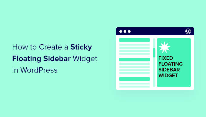
Sticky sidebars, also known as floating or fixed sidebars, are a powerful tool for enhancing user engagement and navigation on your WordPress website. By keeping key content like social media buttons, email opt-in forms, or important links visible as users scroll down the page, you can significantly increase interaction and drive conversions. This article provides a comprehensive guide to creating a sticky floating sidebar widget in WordPress, covering various methods from simple CSS solutions to more robust plugin-based approaches. We’ll explore the pros and cons of each technique, empowering you to choose the best option for your specific needs and technical skill level.
Before diving into specific techniques, it’s crucial to understand the underlying CSS concepts that make sticky sidebars work. The core principle revolves around the `position` property, specifically the `sticky` and `fixed` values.
* `position: fixed;` – This property fixes an element’s position relative to the browser window. The element will stay in the same location on the screen, even when the user scrolls. However, using `fixed` alone can lead to issues if the sidebar is longer than the viewport, as it may cover content at the bottom of the page.
* `position: sticky;` – This property offers a more elegant solution. It behaves like `position: relative` until the element reaches a specified offset (e.g., `top: 0;`), at which point it becomes `position: fixed;`. This allows the sidebar to scroll normally with the page until it reaches the top of the viewport, then it sticks.
The following properties are commonly used alongside `position: sticky;` to control the behavior of the sticky element:
* `top`: Defines the offset from the top of the viewport when the element should become sticky.
Method 1: CSS-Only Sticky Sidebar (Simple Approach)
This method is suitable for themes with relatively simple layouts and requires basic CSS knowledge. It’s the quickest and lightest approach, but it may not work perfectly with all themes.
**Steps:**
1. **Identify the Sidebar’s HTML Structure:** Use your browser’s developer tools (usually accessed by pressing F12) to inspect the HTML code of your sidebar. Note the CSS class or ID that identifies the sidebar container. For example, it might be `
`.
2. **Add Custom CSS:** Go to your WordPress dashboard, navigate to “Appearance” -> “Customize” -> “Additional CSS.”
3. **Write the CSS Code:** Add the following CSS code, replacing `#secondary` with the actual ID or class of your sidebar container:
“`css
* `position: -webkit-sticky;` provides compatibility for older versions of Safari.
4. **Adjust and Test:** Save your changes and refresh your website. Scroll down the page to see if the sidebar behaves as expected. You may need to adjust the `top` value or other CSS properties to achieve the desired effect.
**Limitations:**
* **Parent Container Overflow:** If the parent container of the sidebar has `overflow: hidden;` or `overflow: auto;` applied, the `position: sticky;` property will not work correctly. You may need to adjust the parent container’s CSS to remove or modify the overflow property.
This method offers more control and flexibility than the CSS-only approach. It involves using JavaScript to detect when the sidebar reaches the top of the viewport and then adding a CSS class to make it fixed.
**Steps:**
1. **Enqueue a JavaScript File:** Create a new JavaScript file (e.g., `sticky-sidebar.js`) in your theme’s directory or a child theme’s directory. Then, enqueue the script in your theme’s `functions.php` file using the `wp_enqueue_scripts` action:
“`php
* Replace `’my-theme’` with your theme’s name or a unique identifier.
2. **Write the JavaScript Code (sticky-sidebar.js):** Add the following JavaScript code to your `sticky-sidebar.js` file, replacing `#secondary` with the actual ID or class of your sidebar container:
“`javascript
$(window).scroll(function() {
if (scrollTop > sidebarOffset) {
* This code calculates the initial offset of the sidebar from the top of the document.
3. **Add CSS to Style the Sticky Sidebar:** Go to “Appearance” -> “Customize” -> “Additional CSS” and add the following CSS:
“`css
* `position: fixed;` makes the sidebar fixed to the viewport.
4. **Adjust and Test:** Save your changes and refresh your website. Scroll down the page to see if the sidebar behaves as expected. Adjust the JavaScript and CSS as needed.
**Benefits:**
* **More Control:** JavaScript allows you to fine-tune the sticky behavior based on specific conditions.
**Considerations:**
* **jQuery Dependency:** This method requires jQuery.
For users who prefer a no-code solution or want access to more advanced features, several WordPress plugins can easily create sticky sidebars.
**Popular Plugins:**
* **Q2W3 Fixed Widget:** A popular and reliable plugin specifically designed for creating sticky widgets. It offers options to specify the top and bottom margins, adjust the widget’s width, and prevent overlapping with the footer.
* **Fixed Widget and Sticky Elements:** Another versatile plugin that allows you to make any widget or element on your page sticky.
**Steps (Using Q2W3 Fixed Widget as an example):**
1. **Install and Activate the Plugin:** Go to “Plugins” -> “Add New” in your WordPress dashboard, search for “Q2W3 Fixed Widget,” install, and activate the plugin.
2. **Enable Sticky Widget:** Go to “Appearance” -> “Widgets.” Open the widget you want to make sticky and check the “Fixed widget” checkbox.
3. **Configure Plugin Settings (Optional):** Go to “Appearance” -> “Fixed Widget Options” to configure global settings for the plugin, such as:
* **Margin top:** The space between the top of the viewport and the sticky widget.
4. **Adjust and Test:** Save your changes and refresh your website. Scroll down the page to see if the widget behaves as expected. Adjust the plugin settings as needed.
**Benefits:**
* **Ease of Use:** Plugins provide a user-friendly interface for creating sticky sidebars without writing any code.
**Considerations:**
* **Plugin Bloat:** Using too many plugins can slow down your website. Choose plugins carefully and only install those that provide essential functionality.
* **Sidebar Overlapping the Footer:** This is a common problem, especially when the sidebar content is longer than the viewport.
* **CSS Solution (with `position: sticky;`):** Use the `bottom` property to specify an offset from the bottom of the viewport. For example: `bottom: 50px;` This will stop the sidebar from sticking when it’s 50 pixels above the bottom of the viewport.
* **JavaScript Solution:** Use JavaScript to detect when the sidebar is about to overlap the footer and then remove the `sticky` class or adjust the `top` property.
* **Plugin Solution:** Use the plugin’s settings to specify a “Stop ID” (usually the footer’s ID). The plugin will automatically stop the widget from sticking when it reaches the specified element.
* **Sidebar Width Issues:** When using `position: fixed;`, the sidebar may lose its original width or break the layout.
* **CSS Solution:** Explicitly set the `width` property of the sticky sidebar. For example: `#secondary.sticky { width: 300px; }` Ensure this width is consistent with your theme’s layout.
* **Theme Conflicts:** Some themes may have CSS rules that interfere with the sticky positioning.
* **Inspect the Code:** Use your browser’s developer tools to identify any conflicting CSS rules and override them with your custom CSS. Pay attention to properties like `overflow`, `position`, and `z-index`.
* **Responsive Design:** Ensure your sticky sidebar works correctly on different screen sizes.
* **Media Queries:** Use CSS media queries to adjust the `top`, `bottom`, and `width` properties of the sticky sidebar based on the screen size. For example:
“`css
Creating a sticky floating sidebar widget in WordPress can significantly improve user experience and engagement. By understanding the underlying CSS principles and choosing the right method for your needs and skill level, you can easily implement this valuable feature on your website. Whether you opt for a simple CSS-only solution, a more flexible JavaScript approach, or the convenience of a WordPress plugin, remember to test thoroughly and address any potential issues to ensure a seamless and effective implementation.
