9 months ago,
WordPress Plugin ,
6 Views
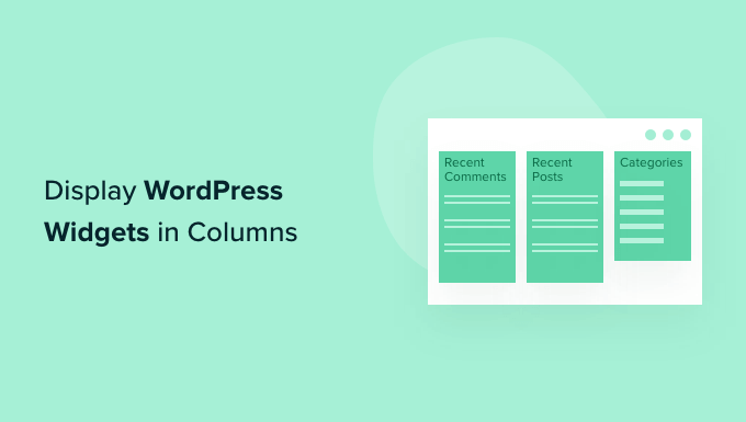
Widgets in WordPress are small, self-contained modules that add specific functionality to your website. They are primarily designed to be placed in widget areas, which are pre-defined zones within your theme (usually the sidebar, footer, or header). Standard WordPress widgets include categories, recent posts, recent comments, archives, a search bar, text (for HTML code), and custom menus. Themes often come with their own unique widget areas and sometimes custom widgets as well, expanding the possibilities.
The default display of widgets is typically stacked vertically, one below the other. While this is functional, it’s not always aesthetically pleasing or conducive to effective information presentation, especially when you have multiple widgets you want to showcase. Displaying widgets in columns allows you to organize and structure your content more effectively, creating a cleaner and more visually appealing website layout. It also gives you more control over how your audience interacts with the widgets, directing their attention to specific elements on the page.
Using columns to display WordPress widgets provides several benefits:
Improved Aesthetics: Columns help break up the monotony of a single, long sidebar, making your website more visually appealing and engaging.
Enhanced Organization: Organizing widgets into columns allows you to group related content, making it easier for visitors to find what they’re looking for.
Better User Experience: A well-structured column layout improves navigation and allows users to quickly scan the content, leading to a more positive user experience.
Optimal Use of Space: Columns enable you to utilize the available space more efficiently, especially in wider sidebars or footer areas.
Increased Flexibility: Columnar layouts offer greater flexibility in terms of content placement and design customization.
There are several methods for displaying WordPress widgets in columns, each with varying levels of complexity and customization options. These include using CSS, plugins, and theme-specific options.
Using CSS to Style Widgets into Columns
This method involves adding custom CSS code to your theme’s stylesheet or using a custom CSS plugin. It offers the most control over the appearance but requires some knowledge of CSS.
Identify the Widget Area: First, you need to identify the HTML ID or class of the widget area where you want to display the widgets in columns. This can usually be found by inspecting the website’s code using your browser’s developer tools (right-click and select “Inspect” or “Inspect Element”). Look for a `` tag or a `
` tag with an ID or class that clearly indicates it’s the sidebar or widget area.
Add Custom CSS: Once you have the ID or class of the widget area, you can add the necessary CSS rules. There are several approaches you can take:
Using the `display: flex;` property: This is a modern approach that provides excellent flexibility. You can use it to create equal-width columns and easily control alignment.
#sidebar {
          display: flex;
          flex-wrap: wrap; /* Allow widgets to wrap to the next row if needed */
        }

        #sidebar .widget {
          width: 50%; /* Adjust the width to create the desired number of columns (e.g., 33.33% for 3 columns) */
          box-sizing: border-box; /* Include padding and border in the element's total width */
          padding: 10px; /* Add some spacing between widgets */
        }
Using the `display: inline-block;` property: This method works well for simpler column layouts, but it can sometimes be trickier to handle spacing and alignment.
#sidebar .widget {
          display: inline-block;
          width: 50%; /* Adjust the width for the number of columns */
          vertical-align: top; /* Align widgets to the top */
          padding: 10px;
          box-sizing: border-box;
        }
Using floats (older method): This is a more traditional approach, but it can be less responsive and requires careful handling of clearing floats. It’s generally recommended to use Flexbox or Inline-Block instead.
#sidebar .widget {
          float: left;
          width: 50%; /* Adjust the width for the number of columns */
          padding: 10px;
          box-sizing: border-box;
        }

        #sidebar:after {
          content: "";
          display: table;
          clear: both;
        }
**Important Considerations for floats:**
To add this CSS, you can:
Edit your theme’s `style.css` file (not recommended for beginners as updates can overwrite changes).
Use the WordPress Customizer: Go to Appearance -> Customize -> Additional CSS and paste the code there. This is the recommended approach.
Use a custom CSS plugin like “Simple Custom CSS” or “CSS Hero”.
Adjust the Width: The `width` property in the CSS code controls the width of each widget, and therefore the number of columns. For example, `width: 50%;` will create two columns, `width: 33.33%;` will create three columns, and `width: 25%;` will create four columns. You may need to adjust this value depending on the overall width of your sidebar and the desired spacing between widgets.
Fine-Tune Spacing and Alignment: Use the `padding`, `margin`, and `vertical-align` properties to fine-tune the spacing and alignment of the widgets. Experiment with different values until you achieve the desired look. The `box-sizing: border-box;` property ensures that padding and border are included in the element’s total width, preventing layout issues.
Test and Responsiveness: After adding the CSS, test your website on different screen sizes (desktop, tablet, mobile) to ensure that the columns display correctly. You may need to use media queries to adjust the CSS for smaller screens to prevent the widgets from becoming too narrow or overlapping. Media queries are CSS rules that apply styles based on screen size or device characteristics.
@media (max-width: 768px) {
      #sidebar .widget {
        width: 100%; /* Stack widgets vertically on smaller screens */
      }
    }
Using WordPress Plugins
Several WordPress plugins make it easy to display widgets in columns without writing any code. These plugins typically provide a drag-and-drop interface or shortcodes to create column layouts.
Install and Activate the Plugin: Search for a suitable plugin in the WordPress plugin directory (Plugins -> Add New). Some popular options include:
“Content Aware Sidebars”: This plugin allows you to create custom sidebars and display different widgets based on various conditions, including page type, category, and user role. It also supports creating column layouts within the custom sidebars.
“WooSidebars”: Specifically designed for WooCommerce, this plugin allows you to replace sidebars on product pages, category pages, and other WooCommerce-related pages. It supports creating custom layouts with multiple columns.
“Advanced Sidebar Menu”: While not solely focused on columns, this plugin offers advanced menu widgets with customizable layouts, including the ability to display sub-menus in columns.
“Q2W3 Fixed Widget”: While primarily for fixed or sticky widgets, it can often be used in conjunction with custom CSS or other plugins to achieve columnar layouts.
Configure the Plugin: Once the plugin is installed and activated, go to its settings page (usually found under Appearance or a dedicated menu item) and configure the options. The configuration process will vary depending on the plugin.
Create a Column Layout: Most plugins will provide a drag-and-drop interface or shortcodes to create the desired column layout. With Content Aware Sidebars, for example, you create a new sidebar and then use the visual editor to arrange widgets into columns.
Assign Widgets to the Columns: Drag and drop the widgets you want to display into the appropriate columns within the plugin’s interface.
Test and Adjust: Save your changes and preview your website to see how the widgets are displayed. You may need to adjust the column widths or spacing to achieve the desired look. Many plugins allow you to adjust column widths directly within the plugin’s settings.
Using Theme-Specific Options
Some WordPress themes come with built-in options for displaying widgets in columns. These options are usually found in the theme’s customizer or settings panel.
Check the Theme Documentation: The first step is to consult your theme’s documentation to see if it offers built-in column options for widgets. The documentation will typically provide instructions on how to access and use these options.
Access the Theme Customizer or Settings Panel: If the theme offers column options, they will usually be found in the WordPress Customizer (Appearance -> Customize) or in a dedicated settings panel (often found under Appearance or a separate menu item).
Look for Column Layout Options: Within the customizer or settings panel, look for options related to sidebar layout or widget areas. These options may be labeled as “Sidebar Columns,” “Widget Area Layout,” or similar.
Select the Desired Number of Columns: Choose the desired number of columns from the available options. Some themes may offer pre-defined column layouts (e.g., two columns, three columns), while others may allow you to specify the column width ratios (e.g., 50/50, 33/33/33).
Save and Preview: Save your changes and preview your website to see how the widgets are displayed in the columns.
Customize Further (if available): Some themes may offer additional customization options, such as adjusting the spacing between columns or setting different column layouts for different screen sizes.
When displaying WordPress widgets in columns, keep these best practices in mind:
Responsive Design: Ensure that your column layout is responsive and adapts to different screen sizes. Use media queries in your CSS or choose a plugin that offers responsive column layouts. Widgets should stack vertically on smaller screens to maintain readability and usability.
Widget Content: Consider the content of your widgets when deciding on the number of columns. Use wider columns for widgets with more content and narrower columns for widgets with less content. Avoid placing very long widgets side-by-side with short widgets, as this can create an unbalanced look.
Widget Titles: Use clear and concise widget titles to help visitors understand the purpose of each widget. Properly structured titles also improve accessibility.
Spacing and Padding: Pay attention to the spacing and padding around your widgets. Add enough space between columns and around each widget to prevent them from looking cramped. Consistent spacing contributes to a cleaner and more professional appearance.
Color and Contrast: Ensure that the colors and contrast of your widgets are consistent with your overall website design. Use a color palette that is easy on the eyes and makes the content readable.
Accessibility: Ensure that your column layout is accessible to users with disabilities. Use semantic HTML and ARIA attributes to provide meaningful information to assistive technologies. Test your website with screen readers to ensure that the widgets are properly announced and navigated.
Testing: Thoroughly test your column layout on different browsers and devices to ensure that it displays correctly for all users. Pay attention to any rendering issues or compatibility problems.
Performance: Avoid using too many widgets in your columns, as this can slow down your website. Optimize your widgets for performance by using caching and minimizing the use of external resources. Use tools like Google PageSpeed Insights to identify and address any performance bottlenecks.
Keep it Simple: Don’t overcomplicate the design. Simpler designs are often more effective and easier to maintain.